For your e-commerce store, popups are one of the finest ways to drive leads and purchases. However, the conversion rate of visitors using pertinent material and a compelling call to action is what determines the effectiveness of your popups. We'll discuss several popup best practices in this article because many websites still violate them. These 8 crucial suggestions are for you if you already use the website lightbox and want to increase conversions!
Pop-ups are context-driven, unlike any other tactic. They are thus brought about by different user behavior. In other words, pop-up advertisements provide you the chance to present tailored offers to visitors to your website at a specific time.
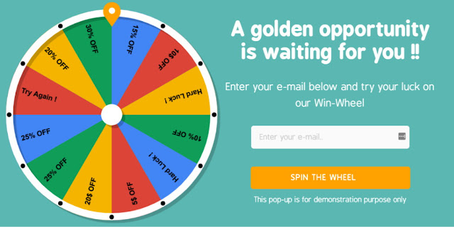
What is the purpose of your new popup, and what do you hope to accomplish with it? Before you begin, ask yourself. In the future, you might prioritize presenting a new product to existing consumers rather than, for instance, creating a subscriber list for your email campaigns right now. Or perhaps your goal is to develop your brand and establish your business as a thought leader in your sector. One can choose to use a fortunate wheel as an example.
This popup is straightforward. Only free delivery and a discount code for 15% off are being provided. Visitors can quickly decide whether or not they are interested in the offer because it is so straightforward.
For instance, on some websites, customers will choose free shipping over a discount code, however, on other websites, the preference will be the opposite. Without experimenting with both and A/B testing various popup types, it is difficult to predict which will be the case.
The biggest impact even the slightest adjustments may have is astonishing. A/B testing cannot be replaced by a popup specialist or marketing genius if you want to find out which version of your popups performs best on your website.
E-commerce businesses can effectively battle their clients' inclination toward procrastination by injecting a sense of urgency. Visitors will be prompted to take action swiftly by language like "for a short time only." Most consumers will frequently delay making that last decision to make their purchase if they have too much time to think about it. One of the easiest methods to make your popups seem more urgent is to include a countdown timer.
What Is a Pop-up Ad
Pop-ups, to put it simply, are sizable modals or windows that take up the entire screen of your website. The purpose of pop-ups, which are quite aggressive website features, is to turn website visitors into subscribers. Pop-ups are triggered by many user behaviors and contexts when designed properly.Pop-ups are context-driven, unlike any other tactic. They are thus brought about by different user behavior. In other words, pop-up advertisements provide you the chance to present tailored offers to visitors to your website at a specific time.
1. Use the right popup use case
What is the purpose of your new popup, and what do you hope to accomplish with it? Before you begin, ask yourself. In the future, you might prioritize presenting a new product to existing consumers rather than, for instance, creating a subscriber list for your email campaigns right now. Or perhaps your goal is to develop your brand and establish your business as a thought leader in your sector. One can choose to use a fortunate wheel as an example.
2. Keep your pop-ups simple
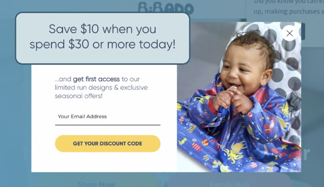
Keeping your popup simple will enhance your outcomes. This is because you only have one to three seconds to persuade visitors to interact with your popup. When making an offer, be sincere but never overbearing. People value offers that are straightforward, honest, and basic. Let's look at this illustration:This popup is straightforward. Only free delivery and a discount code for 15% off are being provided. Visitors can quickly decide whether or not they are interested in the offer because it is so straightforward.
3. Only ask for critical information
Customers detest having to fill out numerous fields to subscribe to a list or take advantage of a promotional offer. Keep your forms concise and easy to fill out because fewer fields mean a greater conversion rate! Many users of e-commerce websites are likewise worried about their privacy and don't want to divulge too much information there.4. Use exit popups
Exit popups are intended to appear just when a visitor attempts to exit your website. This is the ideal moment to display a straightforward, alluring offer that keeps website visitors on your page and motivates them to make a buy right away rather than later. Timing is crucial in this situation; getting your visitors' attention at the proper time has been shown to enhance conversions.5. Be creative when building popups
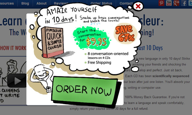
Using popups creatively is a fun method to enhance conversions. The best popups capture visitors' attention, and nothing does it better than a humorous meme or intriguing image! Do not be timid. Customers appreciate it when a company shows some personality. Naturally, you don't want to use any language that could be offensive to a user.6. Always test your lightbox pop-ups
A guaranteed strategy to increase conversions and decrease your bounce rate is to test different popup designs using A/B and multivariate testing. You won't know precisely what makes your popups effective or how to get the outcomes you desire unless you test many iterations of your popups.For instance, on some websites, customers will choose free shipping over a discount code, however, on other websites, the preference will be the opposite. Without experimenting with both and A/B testing various popup types, it is difficult to predict which will be the case.
The biggest impact even the slightest adjustments may have is astonishing. A/B testing cannot be replaced by a popup specialist or marketing genius if you want to find out which version of your popups performs best on your website.


